Given the recent appearance of some of my images in a recent magazine, which were a bit of an embarrassment if I am honest, it might seem strange that I want to touch on the subject of photography but never the less…
My first job was as an illustrator. Illustration is a very proactive thing to do, you have complete control over the end result. My second job was as a photo finisher. Photography is a very reactive thing to do as you have to make the best of what is in front of you. Finishing even more so as you have to make the best of what someone else thought was the best they could do. I am no photographer I can assure you but given that I have finished literally hundreds of thousands of images that are taken by professional photographers I do at least know the theory.
Owning an expensive camera will most likely make your pictures better but it will not make you a photographer, just as owning a pencil will not make you an illustrator but there are a few things that you can do that will help you when taking pictures of models. Photography of models kind of crosses the boundary of the 2 disciplines as you have control over the subject and the camera. Lets start with what not to do.

The above image has several areas that are open to improvement. It’s too saturated, and its over sharpened, it looks too Photoshopped. Also it has too much magenta in it, the wall is a grey/blue in reality not purple. The loco is framed too high and there is a horrible tangent between the roof of the loco and the building behind it.
Finishing
First things first, All images NEED to be finished, what the camera gives you will never be the best it can be. Theres a lot of ways to finish an image in Photoshop but most of them are quick wins and actually go some way to destroying the image. Things like auto levels, brightness/contrast, sharpening, hue/saturation all do the job but badly. The truth is you only need to learn how to use curves as this will do all of those things with far more control and less damage. Basically curves is a line between black and white that can be bent. The other methods are more like a slider on a scale. In curves your white point will be top right, your black point bottom left. Once these are set they will not change so no matter how much you play with the curves your blacks will always be black and your whites will always be white. You can choose to lighten the image in a particular tonal area, such as towards the dark end to bring up the detail in an underframe and it wont effect the highlights. Moving the brightness up moves the whole image and you gain detail in the darks but lose detail in the lights. You can also select channels and adjust them in the same way, focusing on a particular colour in a particular tonal range. Making the curve into an S shape will adjust the contrast again without losing the blacks and whites. It’s very powerful and once learnt (aside from the camera doing something odd) it’s all you really need to know.
Sharpening
Sharpening is best avoided – get the image sharply focussed before you take it not after. However there is a way to improve a slightly soft image without it looking too Photoshopped. Using the sharpen tools in a colour image will sharpen the colours too, this is not what you want to do so the trick is to hop into LAB colour mode (which is immensely powerful but a lot of work to get your head round) select the lightness channel and only sharpen that. Result – a sharper image without affecting the colour
Composition
Having worked with an awful lot of professional photographers composition is not something they are all that sophisticated in, usually because it’s not something they have a lot of control over. Many will use the rules of thirds and that’s about it. (the focus of the picture should be 1/3rd of the way into the image). However illustrators are quite sophisticated in this regard as they do have the control they need. Ideas like leaders, lines of action etc are quite normal and can make an illustration almost move. You will be guided through the image exactly as the illustrator wanted you to be and will not even know that you are doing it. Good Illustrators and designers are some of the most manipulative people you will come across in terms of making you do what they want. With a model its more still life than anything, you set the scene and its worth thinking about how everything interacts to get the result you want. In the image above the loco is too high in the frame. If it were lower it would have more mass to it and would convince the viewer that its heavy.
Tangents
Tangents are a big problem in illustration and to be avoided at all costs. They are a big problem in model photography too but not a lot of people understand them. Referring back to the image of the 31 there is a horrible tangent where the line of the roof between the loco and the building meet. Simply put a tangent is where 2 lines of different things in the image meet. Things like a buffer appearing to join with a signal are common and are things that professionals will look to avoid. It’s what makes the difference between a professional image and one that isn’t. If I had moved the camera down a bit you wouldn’t see the roof of the building, moved it up and the roof would have been distinct so as it is its in just the right place to spoil the image.
Light and doing it badly
Light is where you can really make a difference and a lot of images are lit with little or no thought. (its worth mentioning at this stage that if you want to Photoshop a real sky onto an image of a model its a good idea to make sure they are both lit from the same direction!) This is one area where you can transform an image easily and the best way to do this is to do it deliberately badly.
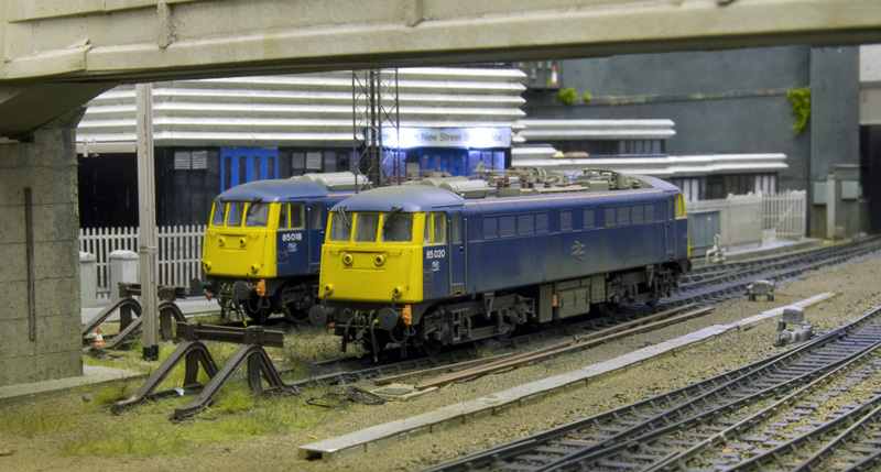 Here we have a fairly typical model image – lit from the direction of the camera but slightly off set. In the real world light is not always where you would like it to be so its worth experimenting with it as a less ideal image can have a better impact
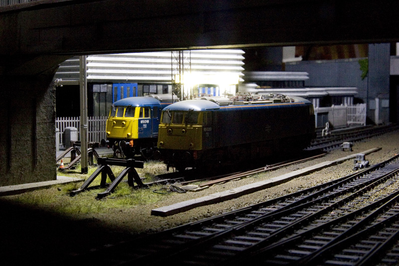 The same image lit from above (where the flood light would be) looks much more interesting even though much of the detail is lost. This sort of image would probably be a reject if taken in the real world but as a model its a bit different or unusual.
Black and White
Theres a right way and a very wrong way to turn a colour image black and white.
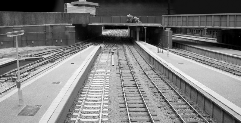 This is the wrong way but its the easiest – convert the image to greyscale. The problem is that the definition between colours is lost. I know that sounds odd in a black and white image but certain colours while very different are also similar in tone. Rail blue and Warning Panel Yellow are a good example and will appear very similar when converted to greyscale.
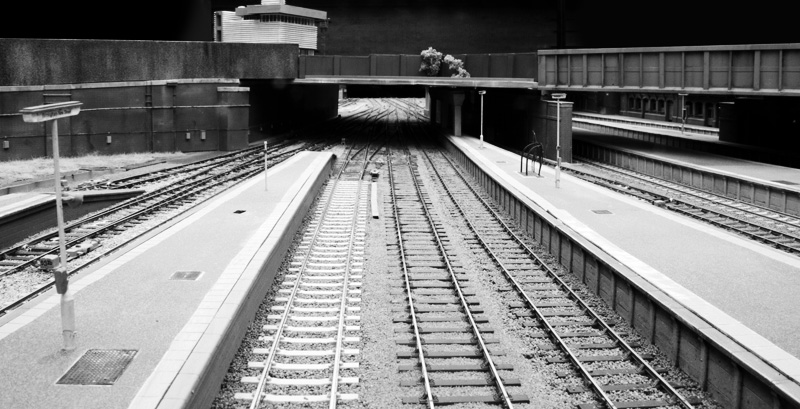 This is the right way and its back to using the Lightness channel in LAB mode. Theres much more definition and tonal variety.
The Photoshop argument
People are either indifferent or heavily against deliberate Photoshopping. Things like adding smoke etc really don’t bother me as the whole process of model railways is trying to fool the viewer into thinking, just for a second, that the object they are looking at is not a foot long piece of plastic but a 100+ tonnes of locomotive. Obviously using Photoshop to fix a bad model is somewhat different. It’s funny how those most vocal against the use of Photoshop usually are the first to defend using the wrong gauge or unrealistic couplings.
Of course if you are going to add a photoshop sky make sure it’s lit from the same direction as the model and if you are going to add a thick exhaust smoke to your steam locos, don’t forget to add it to their shadows too!
Next time you take a model picture think about composition, look out for things like tangents and ask yourself, Can I make this more interesting?
Great article. One of the things that I was taught about composition was not to shoot the obvious, in this case the 3/4 shot of a loco. Instead, look for details and features and focus on these. In short, as you said, composition : think first snap later. Would love to see you expand on this article – it’s a fascinating topic
Thanks Miles
In reality each aspect is a subject in its own right and there are those immeasurably more qualified than me to comment on them. What is here is just a few tips and pointers of things that anyone can learn to do or look out for. I’m often amazed to see poor composition and tangents in magazines let alone the over processed images that seems to be a fad these days. I suppose though it’s worth remembering that a lot of the current crop of model railway photographs are actually taken by modellers rather than professionals.
Where did the top of the wall go in the second shot of the stabled 85s?
It must have fell off! That section if wall is separate at the moment as I need to do the bits behind it. Neve noticed before that it had dissapeared!
It’s amazing the things photography reveals that the eye misses. I had my micro layout set up perfectly for a shot; it was only afterwards that I realised the smoke box door on my 3mt was left open!
The one I consistently miss is couplings that are tangled!