I’ve been looking at little people again. This time a rough mock-up of groups straight from the packet.
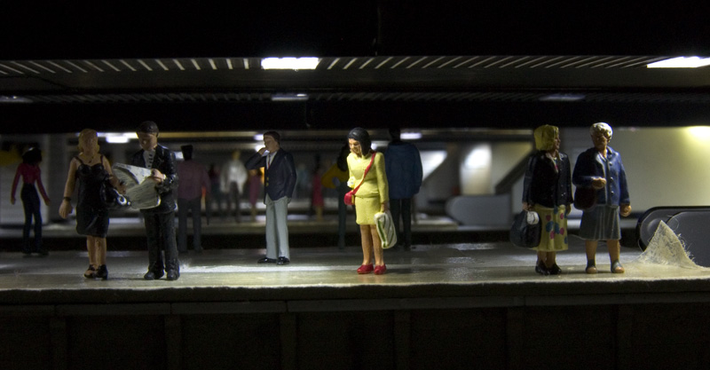
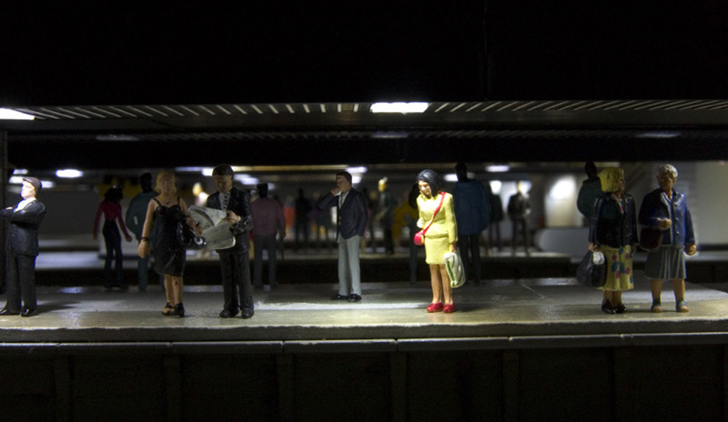 The first thing I have found is that I don’t need as many as I think. In the 2 scenes above, with the exception of the front row theres approximately half as many people in the second image and yet the ‘crowd’ looks pretty much the same.
The second thing I have discovered flies against the perceived wisdom of figure painting that has been transferred over from the military modelling field.
 I have written before about my dislike of the military style. To me it’s over exaggerated and looks almost cartoon like. In my distant past when I was doing illustration as a job the more real you wanted something to look the more delicate and subtle your technique had to be. In the above image I have simply desaturated the image by 50% and reduced the contrast a bit. To my eye, at least it looks closer to how people should look. I would welcome your thoughts.
I think you are spot on Jim. Colours tend to merge and diffuse over distance and to my eyes the last shot of the lady in the yellow suit is much more realistic. In the other shots the colours are too bright and as you observe more cartoon or toy like. Likewise the flesh tones are too orange.
One thing for sure, 99% of people’s clothing doesn’t reflect light, save for the [now rare] odd pair of shoes. I give my little people a coat of ‘Pebeo’ matt after their colour treatment.
I think your ‘duller’ is ‘better’.
Doug
I agree regarding the painting, the overly developed shadowing of the military style is cartoonish. Pale tones, with just enough definition for features etc should be much better, as the desaturated image shows. Pure flat Matt for anything other than leather jackets should be the order of the day too, I think.
Completely agree Jim, with regarded to desaturating the colour. It’s just a variation on the aerial perspective phenomenon. For the same reason, gloss locomotives look wrong in miniature because no account has been taken of the perceived distance. It is necessary to trick the eye into thinking that what you are looking at really is a couple of hundred feet or so away, rather than five or six feet.
To be honest i could not see any significant difference between the two examples . It well be to sutle for me. The lady in the yellow dress and the guy with folded arms look a bit wooden but that has nothing to do with the painting (i think)
Overall though, i would be most pleased if i could reproduce the picture as well as you have Jim.
Qualified agreement Jim, the lady in yellow is gloss, a spray with dullcote would do wonders. A lot of mil modelling techniquies are hugely overdone but look instead to the quick army styles of wargamers.
Mil Modellers tend to be doing single display pieces and go for it; wargamers are looking for mass effect (broad generalisation of course) I actually think that the biggest issue many Mil Modellers have is that they make models of models and try and outdo each other with technique rather than observation of the prototype. I worked on armour for years yet it never resembled the patterns of chipping and weathering that are portrayed (caveat: that was in the NATO non-combat scenario but there were subtle patterns of weathering that are often not reflected by modellers)
Anyway back to figures, the effect you are looking for with the lady in yellow I would achieve by black undercoat (or dark grey if you find that too stark and then dry brush the clothing and flesh colours on. Perhaps a subtle highlight with a particularly prominent crease or cheekbone in a foreground figure but otherwise the creases and folds, including the face are defined by shadow where the undercoat shows through. Never undercoat in white unless you are going to block in the shadows next (so why bother :))
I don’t have any photos to hand but if you have a copy of the Todeller with Hope Under Dinmore as ROM the figures on there are my work.
Subtlety wins – but that is a mainstream mil modeller technique just not one that is highlighted in the mags.
I loved all the comments of the attack of the Preiser little people on FinescaleRR forum! I use and like Preiser because they are better than I will ever achieve. In the last shot above, you have achieved a really believable result which uses shake the box products. The result is convincing and adds realism to the scene. Maybe the magazines should start using this technique when they reproduce their over-glossy photos? You should certainly try putting these images online without comment and see what results you get.
I have to disagree with Kevin above, it’s the quick war games approach which is the problem, dark undercoat, cartoon shading, etc. Full on individual pieces are one thing, but most of those are in larger scales.
For me, the subtlety achieved by not shading etc is what is needed in the smaller scale and where the figures are meant to blend in to the overall scene.
I should add a ps that just because that’s my taste, it doesn’t mean that Kevin’s alternative is invalid, it’s just not for me.
Thanks all
Modelling is like any other creative hobby, part of the person doing it will be reflected as their style. There will be different overall styles too. Some styles will appeal some won’t, that doesn’t man ones better. I used to be into Manga, fantasy art and fashion illustration but that didn’t mean I liked it all. I had favourites such as Kia Asamiya or Atsushi Kamijo for manga, Luis Royo for fantasy art and Ty Wilson for fashion. All are different. I’m not saying the military modelling approach to figures is wrong, just that I don’t like it.
Getting back to the subject, does Dullcote still lighten the base colours?
I’m currently working figures for a magazine article, and as mentioned above there are two extremes from the mil side, the warhammer wargamer style and the fine art approach. I painted the figures that went into Blea Moors carriages and many years ago painted the 7mm figures that featured on MRJ’s Inkerman Street. The de-saturated version above definitely improves the appearance, and one way to achieve that quickly is to use a med/dark gray wash eg RAF Dark Sea Gray, and then the gentlest of highlights with a light gray dry brushed over the top. I say dry brushed, but ‘feathered’ is a better term for the contact. Skin shadow I will use a rust tone as this is less marked than a black high contrast color. Finally finish off the figures with a good quality genuinely flat varnish, like vallejo. Those techniques will get you a consistant finish which will be suitable and workable for large numbers of figures.
Hi Jim,
Totally agreed with the approach on colours and toning them down like you did in the mockup picture. Means you have to re-do all actual models. 😉
Hi Jim,
I think the paler versions of colours work better and look more realistic. I agree with the above comments about colour fade over distance, just have a look on google earth, how many bright colours can you see on there! With regard to the Military modelling style, when you see figures at competitions etc, they are all shaded rather heavily, most using black and grey for the shadows, if you look at real life you see that shadows are just darker shades of the base colour (I feel like I’m teaching granny to suck eggs here!) and to me the use of heavy shadows spoils the effect. My final thought is that gloss finish should never be used on figures, Matt finish for clothes, and if you do need a bit of shine then I would use a satin varnish, gloss makes figures look too toylike. This is just my opinion for what it’s worth. Keep up the great work Jim.
Agree on the techniques that are used to great effect on Warhammer figures (I used to paint these myself, and Dungeons and Dragons back in the day) DO NOT work when trying to recreate realism for a layout.
Cartoonish is the only accurate word that works. there is a guy who sells painted figs on via certain den of evil (“that” rail forum) and while there is no denying the skill of the bloke they just look odd. This technique of painting them black first and using that as the shadow is what causes the exaggeration and low level shadow blending and highlight blending.
I have just finished a set of 120 seated/unpainted Preiser and the only embellishment I added was a little drybrushing here and there to add a few highlights, stops them looking quite so flat.
The above are all clearly Bachmann and while the paint jobs can be a bit blobby they are generally great, but yes they do need a waft of matt varnish or they run the risk of all looking like they are wearing leather or rubber…a bit weird…unless that’s your thing 🙂